My phone has looked the same for almost two years. Same rows of icons. Same plain wallpaper that came with the phone. Same quick settings panel that I open ten times a day without really seeing it. The phone works fine, but it feels like someone else’s phone, not mine.
I thought about changing it many times, but I always pictured hours of work. One app for wallpapers, another for widgets, another for icons. So I kept postponing it, the way we postpone cleaning a cupboard we open every day.
Earlier this year I had a small win when I went to download a golden keyboard theme that made my typing screen feel fresh for weeks. That little change taught me something. A phone does not need a full makeover. It needs one or two changes you actually see every day. This time I wanted the big one, the home screen itself.
That search ended at an app called Themes, Widgets & Wallpapers, also known as ThemeMe. It is free, it holds a rating of about 4.4 from more than 3,300 ratings, and it promises three things in one place: control center themes, home screen widgets, and wallpapers. One app, no juggling. I decided to give it a proper try.
What This App Changes, in Plain Words
Most theme apps change only the wallpaper and stop there. This one goes after the parts of the phone you touch the most.
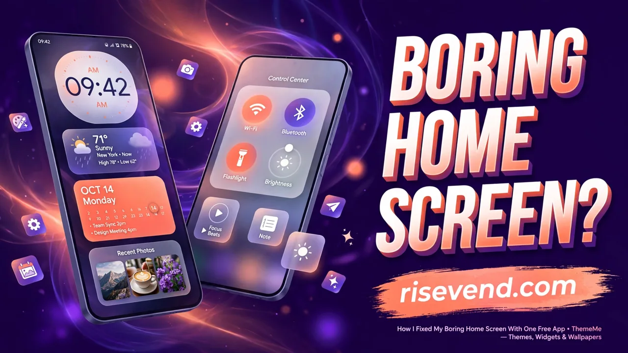
First, it replaces the look of your control center, the panel you pull down for Wi-Fi, brightness, the flashlight, and other quick controls. Instead of the plain panel, you get themed versions with their own colours and style.
Second, it gives you widgets for the home screen. Not just a clock, but calendar, weather, battery, photo, quote, and even GIF widgets.
Third, it carries a wallpaper library, so the background can match the rest of the look instead of fighting it. Theme, widgets, and wallpaper come from the same place, so they sit well together.
A Control Center That Feels Like a New Phone
The control center surprised me the most, because I open it more than any app. Brightness in the morning, Wi-Fi at work, flashlight at night. Always the same grey panel.
With this app, that panel gets a full theme. The styles cover a wide range: Anime, K-pop, Aesthetic, Cute, Sport, Kawaii, Galaxy, Car, and Crystal. I picked a clean galaxy style first, and the panel honestly looked like it belonged to a newer phone.
Under the new look, the controls stay familiar: Wi-Fi, Bluetooth, flashlight, brightness, volume, music, rotation, Do Not Disturb, alarm, calculator, camera, and battery are all within reach. Nothing I used daily went missing. Only the face changed.
One thing worth knowing before you start: to place this themed panel over your normal one, the app uses the Android Accessibility Service. I will explain that honestly in its own section below, because you should understand a permission before you grant it.
Widgets That Look Good and Earn Their Place
A widget has one job. It should tell you something useful at a glance, or it is just decoration taking up space.
The clock widgets are the obvious start. The calendar widget saved me from opening the calendar app again and again just to check a family event date. The weather widget sits next to it, and together they answer the two questions I ask my phone every morning.
The battery widget is useful, especially on an older phone where the small battery icon in the corner is easy to misread. The photo widget is the one my family liked most, because it puts a favourite picture on the home screen where I see it all day.
The quote widget and the GIF widget are pure fun. I kept the quote widget, because a short line that changes daily is a nice thing to see with morning tea. The GIF widget I removed after two days, and the reason is in the mistakes below.
Setting It All Up, Step by Step
The whole setup took me around fifteen minutes, most of it spent enjoying the theme gallery like a child in a sweet shop. Here is the order that worked:
- Install the app and open it. Take a minute to see where the themes, widgets, and wallpapers live.
- Pick your control center theme first. This is the piece you will see most often, so choose a style you can live with daily, not the wildest one.
- Allow the Accessibility permission when the app asks. The app needs it to show the themed control center as an overlay. Read the app’s declaration on that screen before you agree.
- Add two or three widgets, no more. Start with the clock, then the weather or calendar. Leave empty space. You can always add more next week.
- Choose a wallpaper that matches. Pick from the same style family as your theme, so the screen looks planned, not pasted together.
- Live with it for one full day. If a widget has not earned its place by the evening, remove it.
About That Accessibility Permission, Honestly
This is the part many reviews skip, and I do not want to skip it.
Android is careful with the Accessibility Service because, in the wrong hands, it is powerful. So it is fair to ask why a theme app needs it. The answer is practical. The app draws its themed control center as a floating overlay on your normal screen, and Android requires this permission for that kind of overlay work.
The app carries a written declaration. It says the Accessibility Service is used only to provide and maintain the control center overlay, that the app does not read screen content or capture sensitive text through it, does not track your activity across other apps, and does not collect, store, or share personal data through this API.
I am a blogger, not a security lab, so I cannot give guarantees. What I can say is this: the declaration is clear, the permission matches the feature, and the choice is yours. If you are not comfortable with it, use only the widgets and wallpapers, and leave the control center theme off. The app is still useful without it.
Mistakes I Made in the First Two Days
My first mistake was greed. I filled the home screen with every widget the app offered, all at once. The screen looked like a notice board in a busy market. Busy is not the same as beautiful. Removing half of them fixed it in one minute.
My second mistake was mixing styles that fight each other. A cute theme with a dark car wallpaper and a serious quote widget looks confused, not creative. When I matched everything to one style family, the screen calmed down.
My third mistake was judging the new look in the first ten minutes. A fresh home screen feels strange at first because your fingers remember the old places. Give it a day, and your hand learns the new places on its own.
Small Changes Piled Up Into a Fresh Phone
What I like most is that nothing here is permanent or risky. A theme is not a system change. If I get bored next month, I can swap the style in two minutes or remove everything and go back to the plain look.
This is the same reason I enjoy small customisation apps in general. A while back I wrote about how I went to download a charging screen app that shows my own photo inside a glowing ring every time I plug in the charger. That change and this one cost me nothing but a few minutes, and together they make an old phone feel looked after.
If your phone is stuck with the same face it had on day one, this is a gentle place to start. One free app, three kinds of change, and no need to buy a new phone to feel like you did.
One Week Later: Is It Still Fresh?
Yes, and that is the honest test. Novelty fades fast with phone tricks, but a home screen is something you see a hundred times a day, so a good change keeps paying you back in small moments.
I kept the galaxy control center, the clock, calendar, and quote widgets, and a matching wallpaper. The GIF widget stayed removed, and I do not miss it.
If your home screen bores you every time you unlock your phone, try this app on a quiet evening. Start with the control center theme, add only two widgets, match the wallpaper, and give it one full day before judging. Small steps, but your phone will thank you every time you pick it up.